Choosing a main color for your walls is super exciting, but it’s also a big deal. Why? Because the color you pick sets the mood for your whole house! It shapes how your space feels—cozy, airy, modern, or classic—and ties everything together. And it’s not just about finding a pretty shade. Nope, you’ve gotta think about stuff like lighting, furniture, and your personal vibe.
1. Picking the Perfect Wall Color for Your Home
Colors do more than look good—they feel a certain way too. For instance, soft blues and greens are great for creating calm, chill vibes. On the flip side, yellows and oranges bring energy and make a space feel lively. So, while your color choice should totally show off your personality, it also needs to match the purpose of the room. A peaceful bedroom? That’ll need different tones than a fun, buzzing living room or a focused home office.
In the next sections, we’ll dive into how to consider lighting, how you use each room, what’s trending right now, and more. Just think of your walls as a blank canvas—ready to reflect your unique style and turn your house into a true home. Let’s make it happen!
2. The Psychology of Colors in Interior Design
Colors aren’t just something you see—they’re something you feel. They affect your emotions, energy, and even how you interact with a space. That’s why understanding the psychology of color is a game-changer when you’re designing your home. The right hues won’t just match your décor—they’ll enhance your mood and make daily life a little better.
How Colors Affect Your Mood
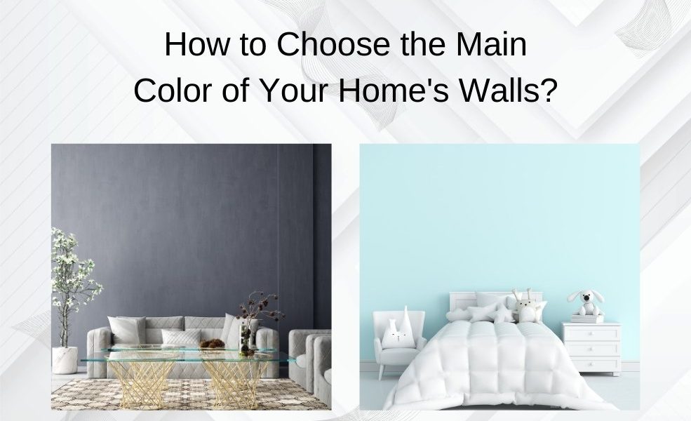
Warm colors like reds, yellows, and oranges bring energy and warmth to a room. They’re perfect for spaces where people gather, like living rooms or dining areas. On the other hand, cool colors such as blues, greens, and purples create a calm and relaxing vibe, which is why they’re great for bedrooms and bathrooms.
Neutral colors—think whites, grays, and beiges—are the ultimate multitaskers. They’re timeless, clean, and super versatile. Plus, they let your furniture and décor take the spotlight. Depending on the shade, neutrals can feel cozy, elegant, or even dramatic. Every color has a story to tell, and it sets the emotional tone of the space.
Warm Colors: Cozy and Inviting
Warm tones are like a big, welcoming hug. Shades like terracotta, mustard yellow, or coral bring life and energy into a room. These colors are perfect for places where you want lively conversations and creativity to flow, like kitchens, dining rooms, or playrooms.
But here’s the thing: too much warmth can be overwhelming. The key is balance. Use bold colors as accents or on a single feature wall. For example, a deep burnt orange wall paired with beige furniture creates a stunning, harmonious look.
Cool Colors: Calm and Relaxing
Want a space that feels like a deep breath? Cool colors are your answer. Soft blues and pastel greens make you think of clear skies and peaceful forests. They’re ideal for rooms where you need tranquility, like your bedroom, bathroom, or even a meditation spot.
Cool colors also have a neat trick—they make small rooms feel bigger and more open. To keep these tones from feeling too cold or sterile, add warmth with wooden furniture, textured fabrics, or plants. This combo makes the room feel calm, cozy, and grounded.
Bottom line? Your choice of colors shapes how a space feels. Whether you want warmth and energy or calm and peace, the right hues make all the difference. 🎨
3. Understanding Natural and Artificial Lighting
Lighting isn’t just about seeing clearly—it’s a game-changer for how your wall colors actually look. The same color can shift dramatically depending on the light it’s exposed to, whether that’s sunlight or artificial light. So, before you commit to a shade, you’ve gotta think about how lighting in your home will bring out (or dull) the tones you love.
How Natural Light Impacts Color
Natural light changes throughout the day, and the direction your windows face makes a big difference. For example:
- North-facing rooms get cooler, dimmer light. Colors can look darker or even a bit muted here.
- South-facing rooms bask in warm, golden sunlight that makes hues look brighter and more vibrant.
East- and west-facing rooms are trickier because they shift. Mornings in east-facing spaces feel warm and sunny, but by afternoon, the light cools down. West-facing rooms do the opposite—cooler mornings, warmer evenings.
Here’s the key: test your color! Put samples on multiple walls and watch how they look throughout the day. A soft beige might seem creamy in the morning light but turn grayish in the evening. Bold blues might feel electric in sunlight but chill out under dim light.
Artificial Lighting’s Role
Artificial light adds another layer to the mix. Different bulbs affect colors in surprising ways:
- Incandescent bulbs give a cozy, warm glow, great for making reds, oranges, and yellows pop.
- LEDs come in warm, neutral, and cool tones, so you can choose based on your color palette.
- Fluorescent lights lean cooler and can make colors feel harsher or less vibrant.
The type of bulb you pick can totally shift how a color looks after the sun goes down.
Adapting Colors for Day and Night
Want your walls to look great no matter the time of day? Start by matching your lighting to your colors:
- Warm white LEDs pair well with earthy tones like taupe, terracotta, or soft beige.
- Daylight LEDs are best for cooler colors like crisp blues, greens, or grays.
Another pro tip? Layer your lighting. Use a mix of overhead lights, lamps, and sconces to highlight different areas of the room. This creates depth, adds ambiance, and ensures your wall color shines in every kind of light.
With a little planning, you can pick a color that looks amazing from sunrise to bedtime. ✨
4. Assessing Room Size and Functionality
When picking wall colors, size and purpose matter—a lot. The right shade can make a small room feel bigger or bring a sense of warmth to a spacious area. And since every room serves a different function, the mood you want to create should guide your color choices. Let’s break it down.
Colors for Small Spaces: Make It Feel Bigger
Got a compact room? Light, airy colors are your best friend. Shades like soft white, pale gray, or pastel blue can make a small space feel open and inviting. These hues reflect light, creating an illusion of extra room. Cool tones like mint green or sky blue are also great for making tight areas feel calm and less cramped.
But here’s the trick: don’t let it feel boring. Add some personality with textures and accents! For example, if your bedroom walls are painted a light gray, pair them with warm wooden furniture or vibrant throw pillows. Glossy or satin finishes can also help by bouncing light around and making the room feel even more open.
Colors for Large Rooms: Cozy and Balanced
If you’re working with a bigger room, you’ve got more freedom to play with bold, rich colors. Deep shades like navy blue, emerald green, or charcoal gray can make a large area feel cozy and full of character. These colors add depth, creating a space that feels inviting rather than empty or overwhelming.
Not ready to go all in on dark walls? Try painting just one feature wall in a bold shade while keeping the others neutral. It adds drama without overpowering the space.
For open-plan areas, you can use color to define different zones. For instance, paint the seating area in a soft beige and the dining area in a darker taupe. This subtle contrast visually separates the spaces but keeps them cohesive. Add texture with things like wallpaper or decorative molding to give the room even more depth and style.
Bottom line? The right colors don’t just look good—they work with the room to enhance its vibe and purpose. Whether you want a tiny room to feel airy or a big space to feel cozy, your walls can make it happen.
5. Coordinating Wall Colors with Furniture and Décor
Your wall color isn’t just a backdrop—it’s the glue that ties your room together! A well-coordinated scheme ensures every piece, from furniture to accessories, feels like it belongs. When picking your wall color, think about what’s already in the room—furniture, rugs, artwork, and even small accents—and make sure the tones work in harmony.
Neutral Wall Colors: The Ultimate Team Player
Neutral tones like white, gray, and beige are total chameleons. They go with almost any style or décor, making them a safe, versatile choice. If you’ve got a minimalist vibe with earthy furniture in taupe or cream, try a soft greige for the walls. It creates a classy, understated look that feels polished but not overpowering.
Neutral walls also let bold statement pieces take center stage. Got a bright red couch or a dramatic piece of art? These will pop beautifully against a muted backdrop. For extra depth, play with tonal layering. For instance, pair light gray walls with darker gray curtains and crisp white trim for a chic, monochrome finish.
Bold Décor? Complement or Contrast
If your décor leans bold or eclectic, your wall color needs to play along. You’ve got two options: complement or contrast.
- Complement: Pair jewel-toned furniture like emerald green or sapphire blue with muted walls in soft blush or dove gray. This combo highlights your bold pieces while keeping the room balanced.
- Contrast: Pick a color from your statement piece and bring it to the walls. For example, if your rug has terracotta and cream tones, try a terracotta accent wall to pull everything together seamlessly.
Pro tip: Less is more. Let one or two bold items shine against a more subdued wall color. This keeps your room feeling stylish and curated rather than chaotic.
By coordinating your wall colors with your furniture and décor, you can create a space that looks effortless and feels intentional. Whether you’re going for subtle sophistication or bold flair, your walls set the tone! 🎨
6. Infographic: Tips for Choosing the Perfect Wall Color
Choosing the right wall color can feel overwhelming, but a simple checklist can make the process easier. Below is an infographic-style guide that breaks down the most important tips to ensure you select the perfect color for your house.
Key Tips for Choosing Wall Colors
- Consider Lighting:
- Natural light enhances true color during the day.
- Use warm white bulbs to add coziness in artificial lighting.
- Test the color at different times of day to see its shifts.
- Start with Neutrals:
- Neutral shades like whites, beiges, and grays are timeless.
- They pair well with bold furniture and accents.
- Use neutrals as a base to layer with colorful décor.
- Match the Room’s Purpose:
- Warm colors like yellows and reds energize social spaces.
- Cool tones like blues and greens promote relaxation.
- Consider the emotional tone you want to set in each room.
- Test Paint Samples:
- Paint swatches on multiple walls to test visibility.
- Observe how colors look under natural and artificial light.
- Compare undertones to avoid unexpected clashes.
- Coordinate with Décor:
- Use your furniture and accents to guide your color choice.
- Create contrast for bold pieces or match tones for a cohesive look.
- Take inspiration from existing artwork or textiles.
- Don’t Overlook Undertones:
- Whites can have warm, cool, or neutral undertones.
- Test undertones in combination with your furniture.
- Think Long-Term:
- Choose shades that fit your style but won’t feel dated quickly.
- Neutral palettes provide flexibility for changing trends.
This simplified checklist helps homeowners narrow down their options while keeping practicality and personal preference in mind. A well-thought-out color choice ensures your walls complement your space beautifully, now and for years to come.
7. Conclusion: Your Walls, Your Story
Choosing the perfect wall color isn’t just about finding something pretty—it’s about creating a space that feels like home. It’s a chance to bring your style to life, make your rooms more functional, and create an atmosphere that feels warm and inviting every single day. From understanding how colors affect mood to factoring in lighting, room size, and décor, every step helps you make a choice that’s practical and stunning.
Think of your walls as a blank canvas, ready to reflect your unique personality. Whether you love calming neutrals, bold statement shades, or a mix of both, there’s no “right” answer—just what feels right for you. Don’t be afraid to experiment! Test out samples, see how they look in different lighting, and trust your instincts to guide you.
With some thoughtful planning and a spark of creativity, your wall colors can transform your home into a beautiful, harmonious retreat that you’ll love for years to come. 🖌️✨